
This is a high key image of a white Persian on a white background, used for the cover of KOT magazine, a cat magazine in Poland, for their April issue in 2008.

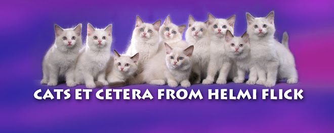
I first heard about "high key" from other photographers ... loosely meaning that the image's midtones are high on the exposure scale, or bright and white. To me, high key images look very elegant. Therefore, I wanted to make a Christmas Card in 2002 that used whites, pale blues, silvers and lilacs to showcase our cats. Unfortunately, I didn't realize that having two essentially black cats would not be in keeping with "high key" ... live and learn. So the above was the result.
After Ken and I shot this (it took days to create the set and then shoot, with a tripod, the cats, two by two), I decided to stick to the more saturated and low key looks that we're known for.
Background: we used white background paper for this shot.
After Ken and I shot this (it took days to create the set and then shoot, with a tripod, the cats, two by two), I decided to stick to the more saturated and low key looks that we're known for.
Background: we used white background paper for this shot.


AWESOME! I love the fact that it isn't the same old boring Christmas colors and that your cats beautifully displayed!
ReplyDelete